SharePoint Online pages are after all rendered as HTML/CSS and Java Script. In this post I will show how to create a responsive design for SharePoint Online pages using Bootstrap so that they look elegant on different screen sizes (Desktop, tablet, phone) .
Bootstrap is the most popular HTML, CSS, and JS framework for developing responsive, mobile first projects on the web. You can start learning about bootstrap
here.
HTML Framework:
Following is the HTML framework that a HTML page should match in order to be responsive to multiple screen sizes.
<html lang="en">
<head>
<title>Bootstrap 101</title>
<!-- Latest compiled and minified CSS -->
<link rel="stylesheet" href="https://maxcdn.bootstrapcdn.com/bootstrap/3.3.5/css/bootstrap.min.css">
<!-- Latest compiled and minified JavaScript -->
<script src="https://maxcdn.bootstrapcdn.com/bootstrap/3.3.5/js/bootstrap.min.js"></script>
</head>
<body>
<div class="container">
<div class="row">
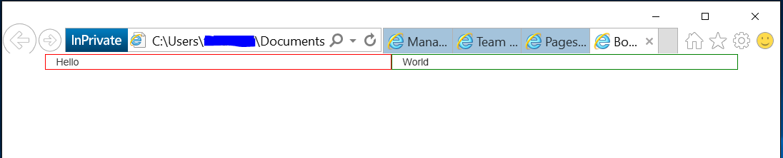
<div class="col-sm-6" style="border:1px red solid">Hello</div>
<div class="col-sm-6" style="border:1px green solid">World</div>
</div>
</div>
</body>
</html>
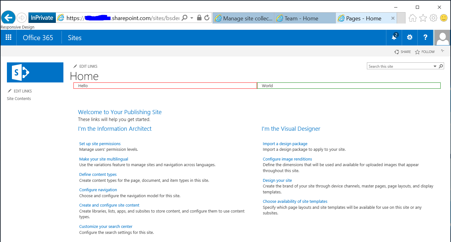
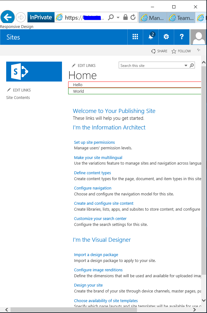
This code will create 2 responsive divs inside a main container div. Container div will render the content inside the two divs as following on Desktop and the Mobile devices with the help of Bootstrap libraries:
 |
|
Desktop
|
Mobile
|
Responsive SharePoint Page:
Now lets incorporate this framework in to a SharePoint Site.
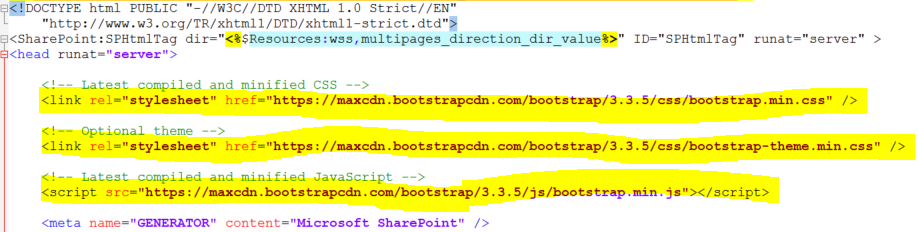
- Add following lines in the head tag of Master Page:
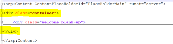
- Add the container div in the page inside the PlaceHolderMain tag so that all the HTML of the page resides inside the container div:
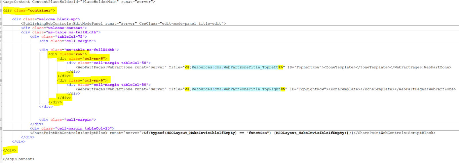
- Add the row div and then add the column divs to hold the actual web parts:
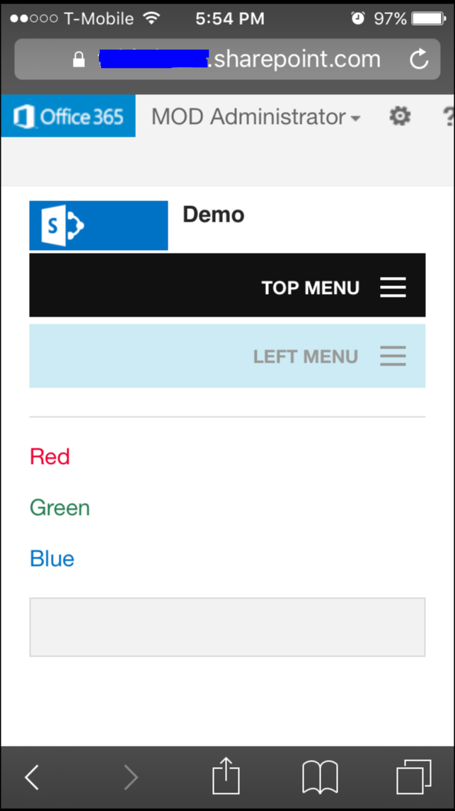
- Now the web parts on the page will be managed by container div and page will look like this on different screens:


 DesktopMobile
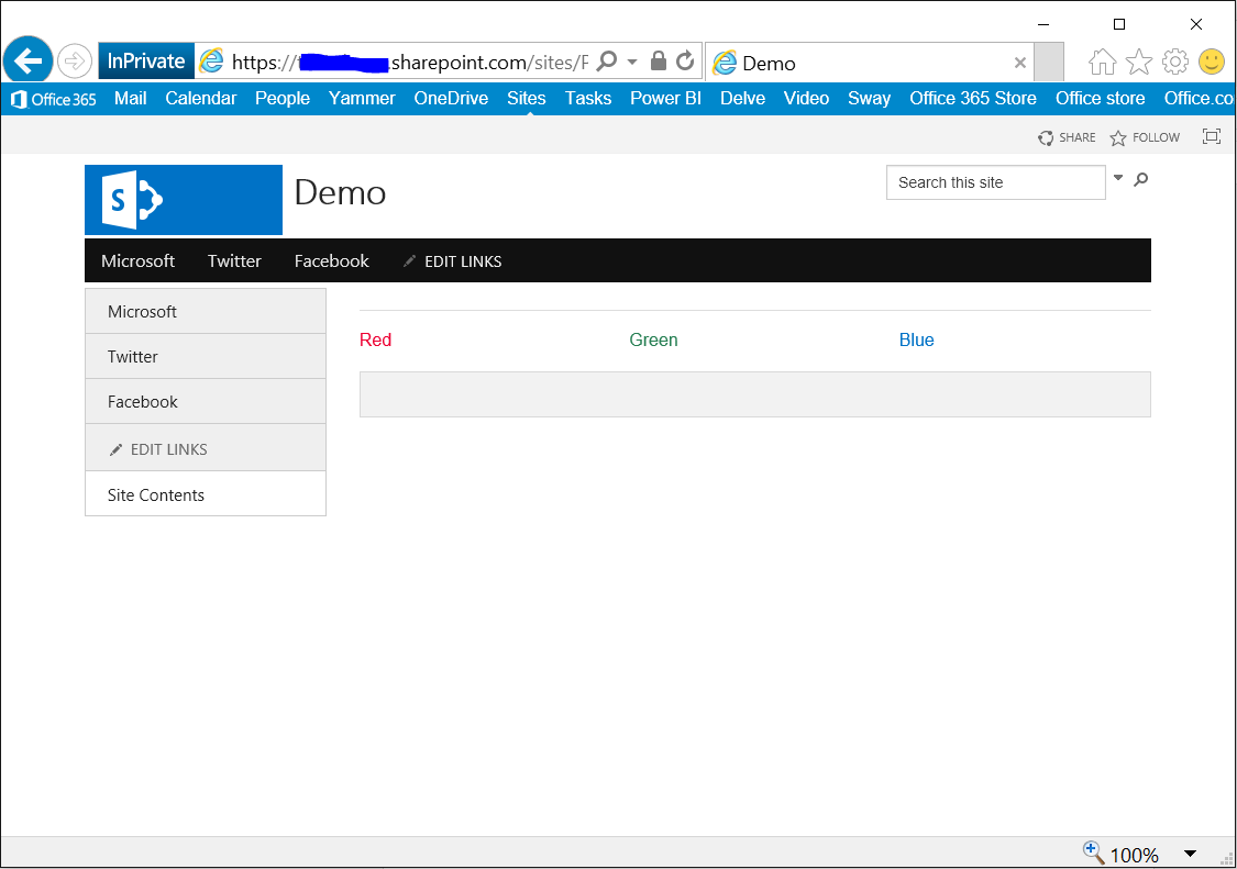